Monday, December 10, 2012

The Grand Finale (Final Portfolio)

Here it is, the moment all of you have been waiting for I am sure. My final portfolio. It is all work that has been on my blog before, but these are what I feel are my 4 best pieces after Midterm Portfolio. I think it turned it pretty good honestly, but we will leave that for Rusty to decide.


First up is my Number 9 project. The concept is that its the 9th hole at Pebble Beach with a sand bunker made to look like a "9". I really like how this one turned out thanks to the colors in it. This one took me awhile because I really was just getting used to this style. I think everything turned out great except the bushes up front are slightly wonky to me sometimes and I am still unsure about some parts of the water, but still I really like the end result. This did get not approved by Rusty. Actually I didn't use anything that Rusty approved in my final portfolio, but I think Rusty is a results guy so hopefully that won't matter to him. There was 12 hours budgeted for this one, I would say After everything, start to print, it took me about 9 hours. See what I did there?...9 hours. But Seriously I think thats about what it took. So under budget, just not as much as normal.


Then there is my book cover for The Great Gatsby. This picture is at the 6.25" x 9.25" for the actual dust cover, but it was printed at 5" x 5" and 3" x 3" also. I really liked this one because this is the only one I actually got looser with after my midterm portfolio. A nice old time dapper lady for the book cover was appropriate I thought, but done in a darker duotone way. The budget on this was 16 hours, after everything was said and done I spent around 6 hours on this project, so way under budget. I usually tend to do that though. Not approved by Rusty, but like I said I didn't use anything that Rusty approved in my final portfolio. So lets hope that doesn't bite me later.


This piece is for the World Record assignment. This guy has one the most flexible face contest the most, yes apparently there contests for that, and this guy is the best at it. I like the oil painting look that this one has. I have always liked oil paintings so I am glad I can do a decent job of recreating it. The forehead and cheeks I think I did really well, but the eyebrows and goatee I worry about sometimes. I still think it turned out good though. Again no approval, but again I don't think Rusty will mind. Again under budget, 16 hours budgeted and I did it in 8. Saving companies all kinds of money. 


Last but not least is my Society of Illustrators piece. This one is my favorite all semester, hands down. I think I liked my inspiration so much for this one that I tried even harder. Just an illustration of a nice cigar and glass of scotch, nothing more. I spent a real long time on this one. I would say 10 or 11 hours with 16 budgeted. So I definitely spent the longest on this piece. When I went into it I had a plan of adding some cool watercolor background, but I finished it and thought and nice reflection would just be classier. Not approved by Rusty of course, but I approve this one. I think that counts for something.


3 Image Gouache

Here is the 3 Image Gouache. I started it forever ago, actually just a few weeks but still. I planned out what I was going to do and everything. I started with the beer first, which I really liked. I also like working with gouache. Then I did the shirt which was alright. Then I did the face and I blew it so then I got mad and just finished it. So it is done, here you go Rusty. I added a cheesy Instagram picture of me working on it because why not. I like painting beer though and I like Workaholics which is what the guy from so there is that.


Life and Death

So here is my life and death illustration. The deal was to make 2 illustrations, each 15" x 10". They were supposed to portray the life and death of something. So I choose the life and death of a restoration, I thought that was a clever idea. I choose to do a classic ferrari, who doesn't love classic ferraris. But I started with the death one and I really liked how it turned out, I tried to go looser with this one. Then I did the life one and I just could not get it to turn out. I think with the death one the rusted colors and dirt worked really well with the technique I choose. With the life one though the car was already in pristine and clean condition, so trying the looser technique took away its shine. It looks like a boring photo now. I am really happy with the death one though, and if it wasn't for the life one I would of used it in my portfolio. This one took about 7 hours I would say. 


Book Cover

Here is a book cover for The Great Gatsby by F. Scott Fitzgerald. I did a nice dapper lady for it. I have been going crazy with the color lately so I tried to make a more duotone looking one. I also tried to get a little more loose in some areas, since I have been so tight on all my other illustrations so far. I think it turned out though. I really do like where it starts to get loose more towards the bottom. This one went fairly well without too many major hiccups which was nice. But here it is.


Sunday, December 9, 2012

Society of Illustrators

Finally got this one done. This one took a long time, a real long time, like 7 or 8 hours. Not sure, I should of timed it. But I am really happy how this turned out, I think its my favorite illustration that I have done so far. Would it not make you want to smoke a cigar and drink scotch? But yea I just like this one, we will see if Rusty will. I honestly could of spent longer on it if I had the time. This is also digital, I don't understand how Rusty does not like digital. I do insane detail that I would never be able to do without it.  Here it is though.


Saturday, December 8, 2012

World Record

Here is my world record illustration attempt. This is an illustration of the world's most flexible face, if you can't tell. I really like this one too, with digital I can go into so much more detail than I could with watercolor. It looks a lot more detailed when it is scaled down like this too. I am really not sure if Rusty is going to like these really tight illustrations, but I tried to talk to him Friday afternoon, but it was Friday so he left early. I don't blame him. So we will take the risk and show them all to him Monday. It is like Vis Comm II all over again.


Number 9

Here is my Number 9 Illustration. The concept is the 9th hole at Pebble Beach with one of the sand bunkers made too look like a "9", clever I know. But I am all over this smudging style right now, I just can't get enough. This one took awhile compared to my other one, at least 4 hours just on the final art without the comp included. I really like how it turned out over all. I don't understand how Rusty hates digital illustration.


Monday, December 3, 2012

Album Cover

Well I am finally back...finally, whether I want to be or not. Almost finals time so time to get stuff done. I actually like working under pressure though sometimes, so we will see how stuff turns out. Lot of stuff in progress but this is the first done. An album cover for a classical artist, this is for Johannes Brahms. His inspiration is alcohol, moonshine specifically. So a little word play for the cover. Its digitally done using a new technique I found out. Put in the colors you want to with a brush where you want, but then use the smudge tool after to make a cool blending effect, turns out cool I think.


Friday, October 19, 2012

3 Image Gouache

So next assignment is a 3 image gouache, we have to do marker compositions of our ideas for Rusty to approve though, so that is what this is. Did it fairly quick, but it does help map out your ideas. Fairly straightforward. Hopefully the actual painting turns out.


Wednesday, October 10, 2012

Midterm Portfolio

Here is my midterm portfolio. Took me a bit to get it all together but here it is. Overall I am happy with it. I never have been great at watercolors so those were definitely the biggest challenge to get up to par. So here it is.

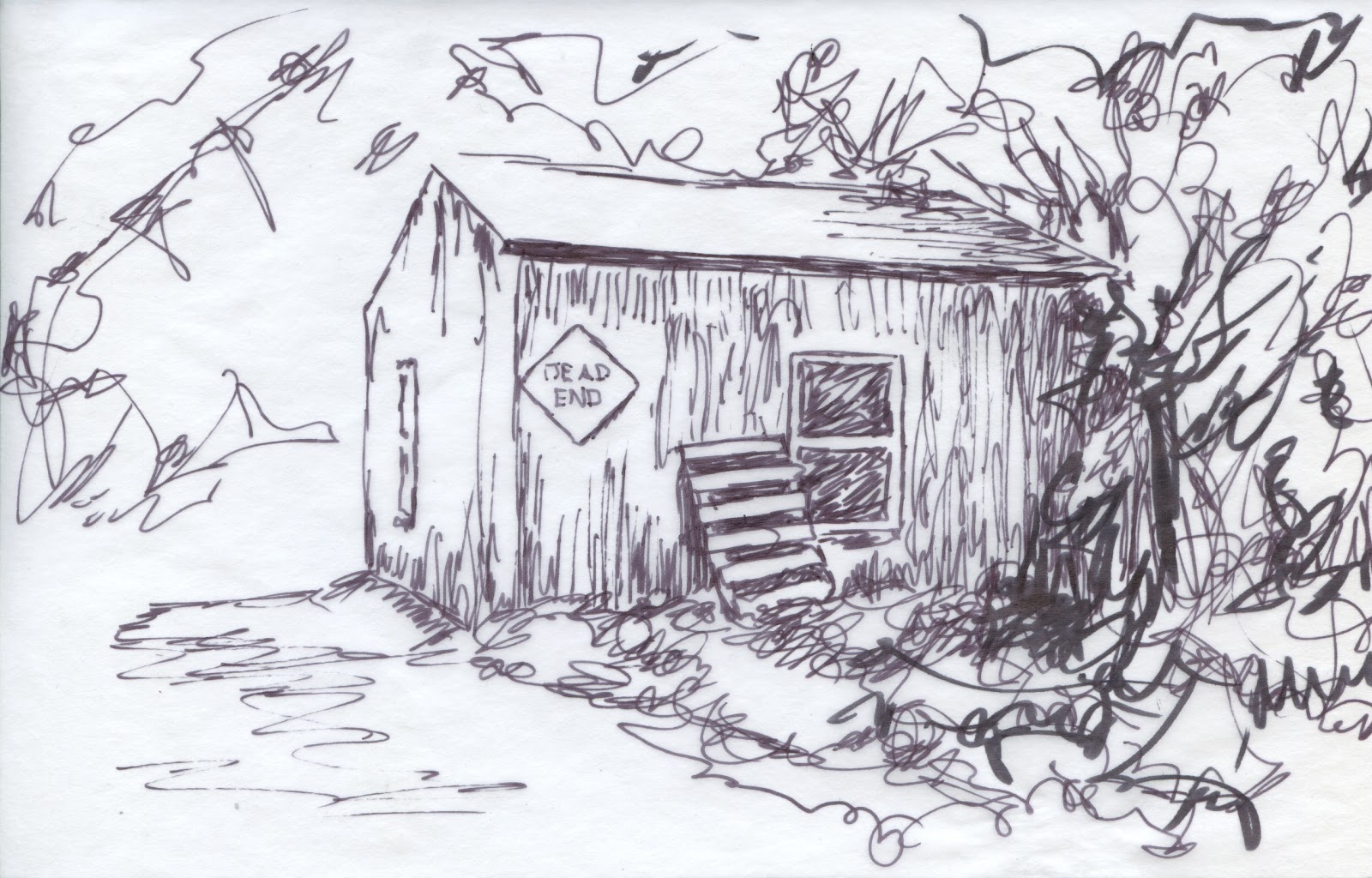
First up are 2 of my best 10-a-day line-art illustrations. Line art is what I am most comfortable so these were the easiest for me. Even though they took a bit longer than watercolor, I still feel like I know what I am doing a little more. I had a few decent line arts but these 2 got the best response.


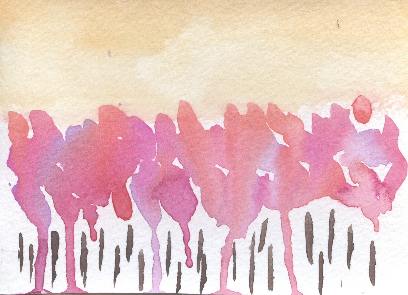
Next up is my 2 best 10-a-day watercolor illustrations. I did not have as many decent ones of these, but I thought these were alright. I tried to do quicker abstract ones, which turned out a lot of bad ones but produced a couple decent ones.


These are 2 of my best line-art and watercolor illustrations. Again, I tried to be more abstract and experiment on these which did not work a lot of the time, but I thought these were kind of interesting. It was kind of a fun process, definitely better on the small scale when its not nearly as bad if you mess up your line drawing.


Next up is my best digital version of anything I have done. Going into this I did not think it would turn out since I had no experience on a tablet, but in the end I really like it. It was kind of nice being able to Command - Z your mistakes away too.


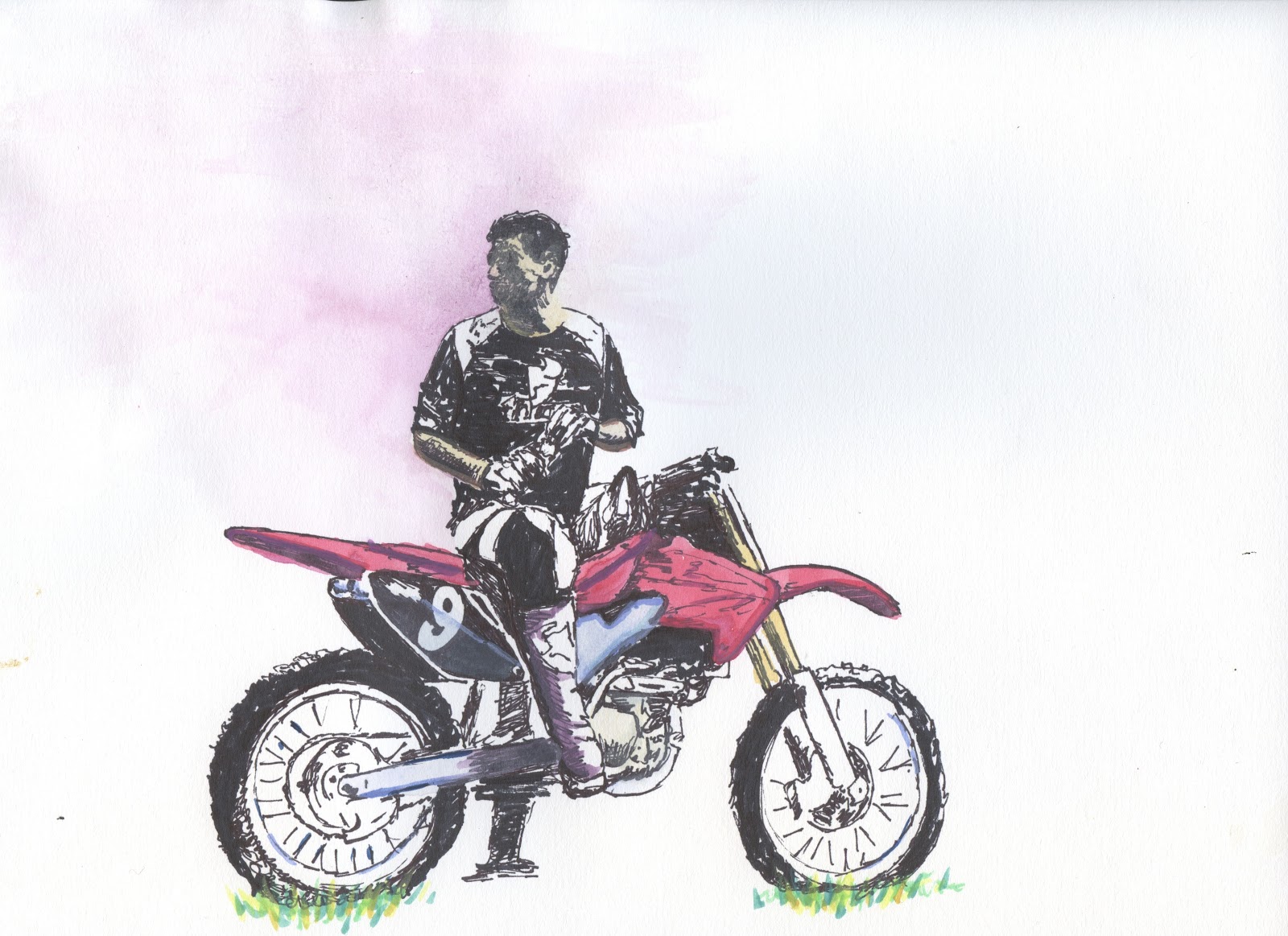
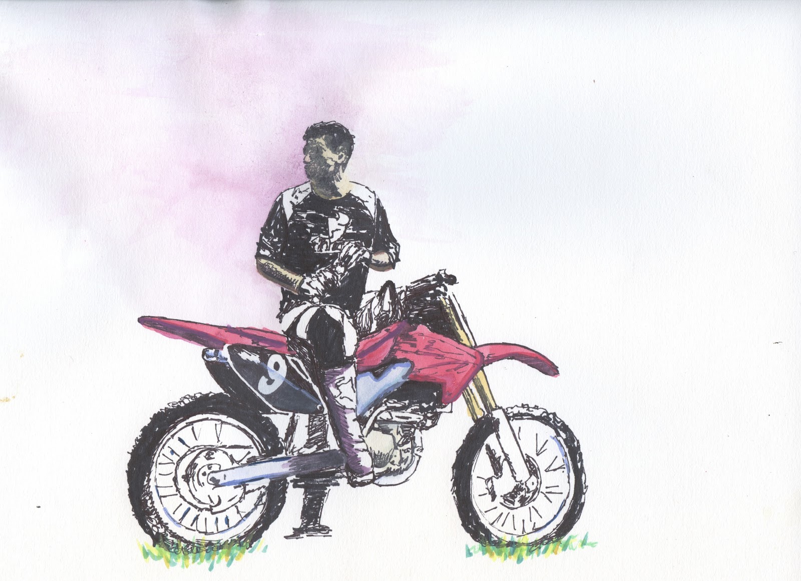
Here is my best Facebook illustration, and it is approved (on the back). This one I mixed line-art and watercolor. I think the line-art is a lot stronger than the watercolor, but I still think it works. Even if it was a mercy approval. Plus its got a dirt bike in it, thats always a plus.


Then there is my product illustration. I actually had a decent watercolor one too, but I always end up going with the line-art. I like this, spent a decent amount of time one it. Also got that approval baby. Its of a watch that tells two times in a weird way if you are confused. I don't know...it looks cool when I where it.


And finally the open category. For this I choose my 20 x 30 watercolor, of course of a tractor. That is all I have pictures of it seems. But I definitely spent the most time on this, but at least I like the way it turned out. The background was actually the hardest part for me since I had no idea what to do, Rusty was nice enough to help me though.


So there you have it. My midterm portfolio. Now no more illustration until the night before the final portfolio, right? On that I am rolling out of K-money. Take it sleazy, and I'm out.

Jackass Painting

I feel like I always end up doing a painting or a drawing of Johnny Knoxville for my studio class, so here is my one for Illustration, not saying there won't be more. It is a pick out Gouache. I think it is starting to work, but I needs a lot more done to it. Hopefully I can come back to it, but I was starting to mess it up so I thought I'd step away from it for a bit. Here is what I got so far though.


Tuesday, October 9, 2012

Sean Never Looked So Good

Oh holla holla holla, something done on time for once. Check it out, tablet drawing of Mr. 007 with a mustache himself. Did it using the same subtractive process as the other one, except this one on the computer. I am actually kinda of happy how this one turned out, but I don't want to get my hopes up too much because I know how Rusty loves to crush them. But here it is, Suck it Rusty (Trebek).


Monday, October 8, 2012

Sean Connery

Here is my attempt at a pick out Gouache. It is supposed to be Sean Connery. Rusty says needs some more structure and I can see that. I didn't think it was going to turn out but in the end it started to come around. Hopefully I can touch it up and make it work a little better.


One more Tractor

Here is a big ass tractor. This took awhile, like a lot longer than I thought it would. I am done though, maybe throw on a wash or something if Rusty whines about the white space. We will see. Kinda happy how it turned out though which is weird.

Wednesday, October 3, 2012

Mercy Approval

I did a little work on the self portrait and got it mercy approved, which is fine by me. C's for dayzzzzzzzz baby.


 Also to my loyal blog followers (the 3 of you) sorry I have been completely blowing it lately. As my apology here is this sweet Striptease video. Enjoy.

Friday, September 28, 2012

Rejection Hurts

So today we had due a 8" x 10" (or close) water color of one of our Facebook profile pictures. I was kinda excited for this because I thought it would go well, as you can see it did do quite that. I'm not too disappointed with it but Rusty still rejected it because the face was too overworked, which I can see. I will try and fix it, if not I will have to redo it. Here it is for now though.


Wednesday, September 26, 2012

Surprise, More Watercolors

Here are 10 more watercolors. Rusty wanted 5 with line art on top of a color wash and 5 with color wash over line art. I was a little pressed for time with these so I don't think any of them really turned out except for one or two. I need to sit down and just figure this watercolor out, but I'm just playing catch up at the moment so that really isn't possible. I do miss projects where I got to sit down and think about what I wanted to do and how to do it. Until then, here are 10 more lackluster watercolors.


Monday, September 24, 2012

Check out this Bullet

Here is a watercolor I did in class today. It is of a bullet because that is what I had a picture of and it seemed easier. If you would like to think it represents the war on terror or something like that too then go ahead, that's cool too. It turned out decent I feel. Composition isn't there because I plan to crop it and what not. Rusty helped me with this one so that might have something to do with it.


Face Time

So I have really been slacking on this whole blogging thing. It probably has something to do with the whole watercolor thing. I'm still not good at it. But since I can't seem to blog on time all my posts will be out of order, sorry Rusty. Here are 5 people, I cant do watercolor let alone do people. For my references I just Facebook creeped on people, its nice to hace a reason to do it. So here they are.


Sorry about those creepy eyes


Monday, September 17, 2012

More Watercolor

Here are 10 more watercolors. These had to be of landscapes and had to use color schemes. I tried to get looser with these than the last ones. A lot of them didn't work, but a couple turned out decent. You be the judge. Still not as confident with watercolor as line art.